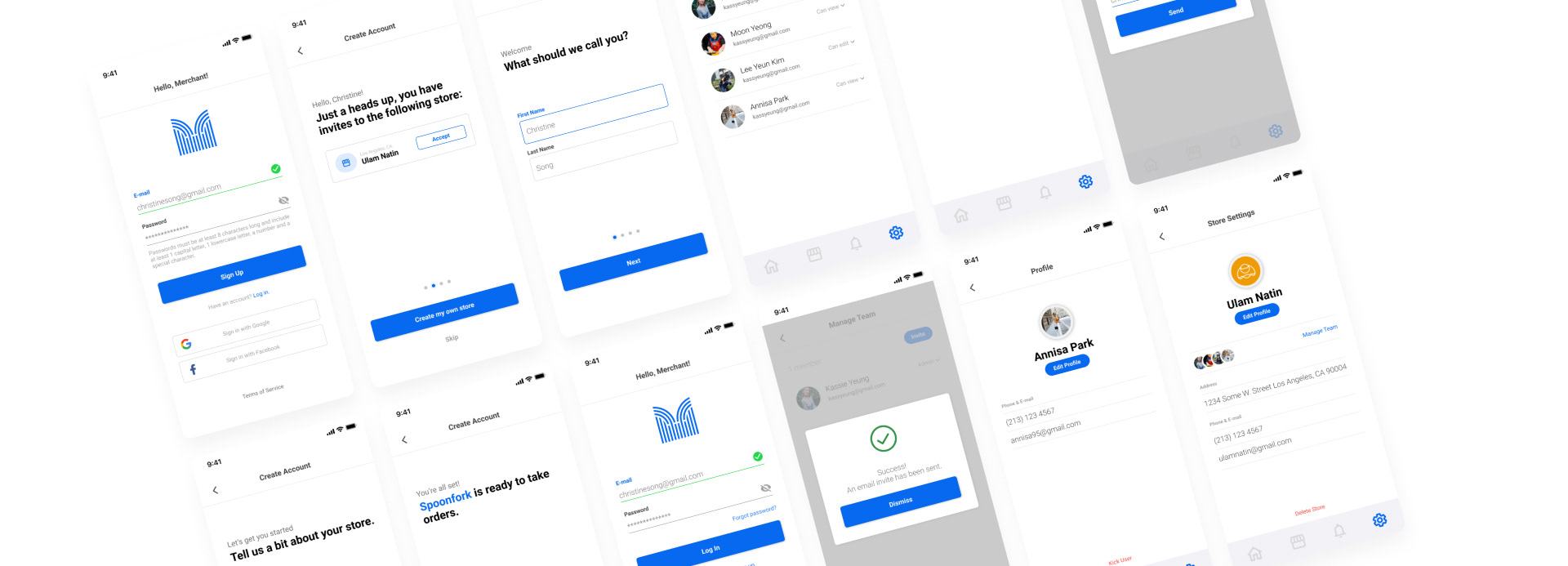
The Merchant app utilizes Caravan, a design system, to efficiently and consistently create cohesive user interfaces, interactions, and experiences with speed and precision.
Our design language strikes a balance between rationality and functionality, ensuring that the visual elements not only look appealing but also serve their purpose effectively.
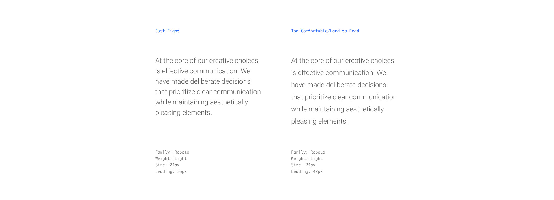
Merchant provides the admin with a deliberately selected typeface that encompasses a diverse range of fonts. This collection of fonts plays a pivotal role in establishing a visual hierarchy across the product.
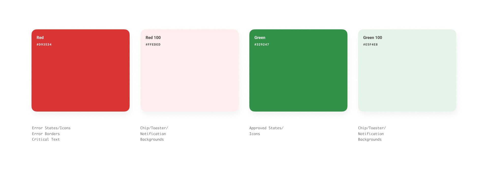
Merchant employs colors strategically to reflect the functionality of specific elements within the interface, enabling the creation of intuitive and predictable patterns that enhance the user's interaction with the product.
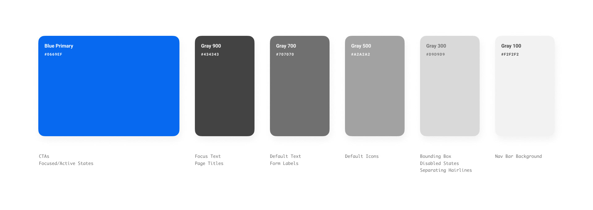
We are mindful of individuals with visual impairments, including those who are color blind or have limited vision, when selecting our colors.
Color plays a crucial role in guiding user decisions within our product. Through our developed design language, we utilize color to lead users and facilitate decision-making. This design language complements the thoughtful hierarchy established throughout our product, enhancing the overall user experience.
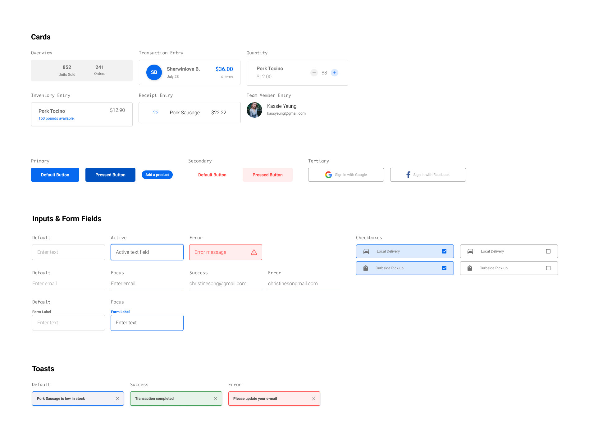
The components within Merchant serve as a library of reusable interface blocks that can be employed consistently throughout the platform. This approach ensures a seamless design experience across various sections of the application, freeing up valuable time to focus on addressing distinctive challenges and complexities within the system.